
The colors that surround us profoundly impact our mood, energy, and sense of harmony with our environment. Whether you’re redesigning your living room, planning a garden, or refreshing your wardrobe, understanding your unique color foundation creates a powerful framework for all your aesthetic decisions. This guide will walk you through discovering your personal color palette and applying it across your living spaces for a more harmonious, vibrant life.
Understanding Color as a Personal Element

Color isn’t just about trends or subjective preference—it’s about finding the palette that resonates with your natural features and creates harmony in your surroundings. In my fifteen years working with clients on their spaces, I’ve seen how transformative the right colors can be when they truly connect with a person’s innate coloring.
The concept of personal color analysis originated in fashion but extends beautifully to our living spaces. Essentially, the process involves examining a person’s skin tone, eyes, and hair to determine their most flattering seasonal color palette, which can then guide color choices throughout their home and garden.
The Seasonal Color System: Your Color DNA

The seasonal color system organizes colors into four main seasons, each with distinct characteristics:
| Season | Characteristics | Best Colors | Effect |
|---|---|---|---|
| Spring | Warm, clear, bright | Clear yellows, warm pinks, bright greens | Energetic, fresh, youthful |
| Summer | Cool, soft, muted | Soft blues, lavenders, muted pinks | Calming, elegant, refined |
| Autumn | Warm, muted, rich | Terracotta, olive, mustard, russet | Cozy, earthy, substantial |
| Winter | Cool, clear, high contrast | True blues, clear reds, bright whites | Dramatic, bold, sophisticated |
These seasonal palettes aren’t merely about which colors are subjectively appealing on you—they form a coherent system of hues that harmonize with each other and with your inherent coloring.
 Creating Visual Weight Without Heaviness: A Designer’s Guide to Balanced Spaces
 Decorating With Meaningful Objects: Breaking Free From Display Conventions
Creating Visual Weight Without Heaviness: A Designer’s Guide to Balanced Spaces
Decorating With Meaningful Objects: Breaking Free From Display Conventions
Creating Visual Weight Without Heaviness: A Designer’s Guide to Balanced Spaces
 Renter-Friendly Balcony Flooring Transformations: A Comprehensive Guide
Discovering Your Personal Season

Before bringing colors into your space, you need to understand which seasonal palette aligns with your natural features. Here’s how you can determine your season:
Self-Assessment Method
- Look at your skin in natural light without makeup
- Examine the color of your veins (blue/purple suggests cool undertones; green suggests warm)
- Notice your natural hair color (even if currently dyed)
- Observe your eye color including flecks and patterns
- Consider which jewelry tones (silver or gold) complement your skin best
Case Study: Sarah’s Color Transformation
One client, Sarah, approached me near her 60th birthday feeling that her appearance had lost its vibrancy and wanting help to reclaim it. Through online color analysis, we identified her as belonging to the “Light” color profile within the tonal system. This profile thrives with soft, airy colors that complement her features and the natural aging process.
This newfound understanding extended beyond her wardrobe and into her home environment, creating spaces that enhanced her natural beauty instead of overshadowing it. The nature of compliments she received shifted; rather than comments focused solely on her clothing, people began remarking, “You are glowing” and noting how consistently “put together” she looked.


Translating Your Season to Your Home
Once you understand your personal color foundation, applying it to your living spaces creates remarkable harmony. Here’s my three-step approach:
Step 1: Choose Your Palette

Before selecting paint colors, consider the emotional impact of color. Choose 3-5 colors that connect with you emotionally and also align with your determined seasonal palette.
For instance, a client identified with autumn coloring selected:
- Terracotta – For warmth and a grounding effect
- Olive Green – To evoke natural tranquility
- Amber – Adding subtle energy
- Deep Navy – As an anchoring accent
Step 2: Map Out Your Color Flow

Visualize how colors transition between rooms, creating a continuous flow. I frequently guide clients to view their home as a whole rather than designing each room independently.
When assisting a “Winter” client with their Chicago townhome, we developed a palette featuring cool blues, crisp whites, and deep charcoals. The most striking colors were used in communal areas, while softer variations were applied in private spaces, resulting in a cohesive experience throughout the home.
Step 3: Select an Anchor Piece

Select an artwork or rug that embodies your chosen colors. The advantage here is that your personal design palette has already been validated through two key filters:
- You’ve recognized what naturally appeals to you
- A designer proficient in color theory has already harmonized these colors within the piece
This chosen item then acts as the central color guide for the entire room.


Practical Applications of Your Color Foundation
For Interior Spaces
The same visual principles that determine which colors enhance your personal appearance also apply to your living environments. Simply mixing any colors won’t work; the eye instinctively seeks cohesion and balance.
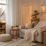
During the design of my own home, realizing my seasonal type is autumn guided me towards muted, earthy tones. These warm, cozy shades harmonize perfectly in my family room, complementing our brick fireplace. Conversely, for a client with summer coloring, we utilized cooler, lighter hues in their living room to foster a relaxed, easy-going atmosphere.
Keep these factors in mind when applying your color foundation at home:
- Room orientation: North-facing rooms tend to be cooler and might benefit from warmer palettes, whereas west-facing rooms receiving intense afternoon sun may require cooler tones for balance.
- Existing architectural elements: Treat wood tones, stone features, and built-in components as integral parts of your overall color scheme.
- Transitions between spaces: Ensure seamless flow by choosing colors for adjacent rooms that complement one another.
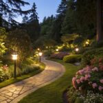
For Your Garden
In garden design, color selection significantly shapes the created atmosphere. As I often explain to clients, cool colors tend to induce calm, whereas warm colors draw attention and inject excitement.
For a garden project in the Pacific Northwest, we drew inspiration from the nearby meadow, replicating its subtle palette which included:
- Purples and silvers to foster serenity
- Strategic use of pinks for cheerful highlights
- Varied shades of green to provide cohesion
- Touches of light blues and whites for soothing effects
Silver: The Universal Mixer
Silver acts within a garden much like an adept host at a gathering—it blends effortlessly with all other elements. Its iridescent quality highlights plant textures and casts striking shadows as daylight shifts. Incorporating plants such as artemisias and ozothamnus introduces this dynamic quality to garden layouts.
Beyond Aesthetics: The Practical Benefits
Understanding and applying your personal color foundation offers clear advantages:
1. People Notice You, Not Just Your Spaces
When your surroundings harmonize with your natural coloring, attention shifts towards you, rather than just the decor. After we redesigned her living areas to match her spring palette, one client shared her experience: “I finally feel like my home is an extension of me, not something separate.”
2. Save Time and Money
Shopping decisions become less daunting, quicker, and more cost-effective when guided by a clear color strategy. Rather than making arbitrary choices or chasing short-lived trends, you can confidently select items you’ll appreciate long-term.
3. Create Cohesive, Flowing Environments
A home designed with a mapped-out color plan feels deliberate and harmonious. Grounding design choices in our personal color foundation leads to spaces that flow naturally and enhance our sense of well-being.
Practical Next Steps
To start implementing your personal color foundation:
- Test your seasonal color analysis using online tools or seek guidance from a color professional.
- Develop a digital mood board featuring images that resonate with you, looking for recurring color themes.
- Obtain large color swatches or sample paint pots to test hues on your walls, observing them under different lighting conditions throughout the day.
- Begin with smaller accent items before committing to significant color alterations.
- Pay attention to your emotional reactions to various colors within your environment.


