
Visual weight is a powerful design principle that influences how we perceive and experience our surroundings. When properly balanced, it creates spaces that feel intentional, harmonious, and inviting without overwhelming the senses. This guide explores how to master the delicate art of creating meaningful visual weight without heaviness across interior and exterior spaces.
Understanding Visual Weight in Design

Visual weight refers to how much attention an element commands within a space. It’s not about physical heaviness but rather the visual impact objects make on our perception. Every element in a room—from furniture to color choices to empty space—contributes to the overall visual weight distribution.
In my years designing both residential and commercial spaces, I’ve observed that clients often struggle to articulate why a room feels “off.” The culprit is frequently an imbalance of visual weight creating subtle tension for the viewer.
Key Factors Influencing Visual Weight

Several elements determine how “heavy” an object appears visually:
Size and Scale
Larger objects naturally command more visual weight than smaller ones. When placing a substantial piece like a sectional sofa, we must consider how it interacts with surrounding elements to maintain balance throughout the space.
Color and Saturation
Color dramatically affects visual weight, following this general hierarchy from heaviest to lightest:
| Color Properties | Visual Weight | Examples |
|---|---|---|
| Dark, saturated colors | Very heavy | Black, navy, deep burgundy |
| Rich, intense colors | Heavy | Emerald green, royal blue |
| Medium tones | Moderate | Sage, terracotta, steel blue |
| Pastels and light colors | Light | Blush pink, sky blue, mint |
| White and very light neutrals | Very light | White, cream, pale gray |
As a general rule, experts note that darker, moodier, more saturated, and warmer colors tend to appear visually heavier, whereas lighter, cleaner, less saturated, and cooler colors seem lighter.
Texture and Material
Textured surfaces carry more visual weight than smooth ones. Stone and concrete feel visually heavier than glass or acrylic. Even small textural elements can serve as effective counterweights to larger smooth surfaces.
Shape and Complexity
Geometric shapes (squares, rectangles) possess more visual weight than curved or irregular shapes of the same size. This interesting principle suggests why a square feels “heavier” than a circle of identical dimensions—perhaps because the circle appears as though material has been removed.


Strategies for Creating Balanced Visual Weight
Now that we understand what influences visual weight, let’s explore how to create meaningful weight without overwhelming spaces.
Strategic Distribution of Elements

I’ve found that distributing significant visual weight across a space rather than concentrating it in one area creates better balance. You can achieve this by:
- Spreading dark or substantial elements throughout the room
- Creating secondary focal points to counterbalance primary ones
- Using the “triangle method” to place similar visual weights in roughly triangular arrangements
- Ensuring no single wall or area monopolizes attention
When one client’s bedroom felt imbalanced due to dark, heavy chairs commanding too much attention, we redistributed visual weight by incorporating elements that drew the eye throughout the space.
Masterful Use of Color

Color is perhaps our most powerful tool for manipulating visual weight. Consider these approaches:
- Use darker colors at lower levels to ground the space (like darker lower cabinets with lighter upper cabinets)
- Create “pops” of saturated color as focal points within an otherwise neutral palette
- Employ color blocking to distribute visual weight intentionally
- Recognize that certain colors inherently feel heavier; for instance, reds and blues often carry more weight than yellows or oranges.
Leveraging Shape and Form
The inherent visual weight of different shapes can be strategically employed:
- Use curved or irregular forms to lighten spaces where needed
- Incorporate geometric shapes as anchoring elements
- Consider how mirrors with irregular shapes carry less visual weight than rectangular ones of the same size
- Balance structural rectangular elements with organic, curvilinear counterpoints
I recently designed a foyer featuring a round mirror specifically because, as noted in design principles, “Because of its irregular, round shape, it has less weight than a rectangle mirror of the same size”. This choice prevented the mirror from overwhelming the entry space.
Creating Balance Through Texture

Texture creates visual substance without the heaviness often associated with large objects or dark colors:
- Incorporate natural materials with inherent textural interest
- Use textiles strategically to add weight without bulk
- Layer different textures to create depth and dimension
- Keep in mind that textured elements are generally perceived as visually heavier compared to smooth, non-textured ones.
The Power of Contrast

Contrast naturally draws attention to elements and increases their visual weight. You can use this principle by:
- Juxtaposing light and dark elements
- Combining smooth and textured surfaces
- Pairing geometric and organic shapes
- Creating intentional contrast rather than uniform visual weight


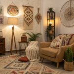
Applications in Different Spaces
Let’s explore how these principles apply in various contexts.
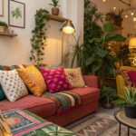
Living Rooms: Creating Comfort Without Heaviness
Living rooms often contain our largest furniture pieces, making visual weight particularly important. When designing living spaces, we should:
- Balance large sofas or sectionals with appropriately scaled accessories
- Create distributed focal points rather than a single dominant element
- Use area rugs to anchor seating arrangements without adding heaviness
- Incorporate negative space to prevent visual congestion
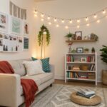
Case Study: The Airy Modern Living Room
A client wanted their small living room to feel spacious yet substantial. We:
- Selected a medium-gray sofa (rather than black) as the anchor piece
- Used a glass coffee table with a substantial geometric base
- Added textural elements through natural fiber rugs and woven accents
- Incorporated strategic negative space to let the room “breathe”
The result was a space that felt complete and intentional without heaviness.
Bedrooms: Balancing Intimacy and Airiness
Bedrooms benefit from visual weight that promotes rest without feeling oppressive:
- Consider headboards with texture rather than just size or darkness
- Balance bed size with proportional nightstands and lighting
- Keep floor space open where possible
- Use ceiling treatments judiciously to bring visual weight upward without lowering the ceiling
When designing bedrooms, I prioritize “variety and contrast” to achieve balance. A recent project featured a substantial bed frame balanced by lighter elements throughout the room, creating a harmonious environment for rest.
Kitchens: Functional Weight Distribution
Kitchens require careful attention to visual weight to maintain functionality:
- Consider contrasting upper and lower cabinetry (lighter above, darker below)
- Use open shelving strategically to break up wall cabinets
- Add visual interest through backsplashes rather than heavy structural elements
- Incorporate plants and natural elements to add organic visual weight
One kitchen I redesigned featured an island that commanded too much attention. By adjusting surrounding elements and incorporating complementary visual weight throughout the space, we created better balance while maintaining the island as a functional centerpiece.
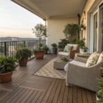
Gardens and Outdoor Spaces
Gardens present unique challenges for visual weight, as elements change with seasons and growth:
- Use the interplay of “voids and masses”—the relationship between planted areas and open spaces—to create rhythm through the landscape.
- Balance hardscaping elements with planted areas
- Consider the mature size of plants when planning visual weight
- Create asymmetrical balance for a more natural feel
Achieving balance in garden design involves thoughtfully considering numerous elements, including the relationship between open spaces (voids) and planted areas (masses), variations in light and shade, feelings of enclosure versus exposure, color palettes, movement, and the overall character of the planting. The dynamic nature of gardens means visual weight must be planned with growth and seasonal changes in mind.


Common Challenges and Solutions
Challenge 1: Top-Heavy Designs
When too much visual weight sits high in a space, it creates an uncomfortable, potentially oppressive feeling.
Solution: Ground designs with visual weight at the lower levels, gradually decreasing weight as you move upward. Achieving proper visual weight and balance often requires redistributing elements to prevent top-heaviness.
Challenge 2: Disregarding Negative Space
Many designers and homeowners fill every surface, eliminating the contrast needed to appreciate visual weight.
Solution: Incorporate deliberate empty spaces that allow the eye to rest and other elements to shine. Remember that balance includes the relationship between “stuff versus space”.
Challenge 3: Overly Uniform Visual Weight
When everything in a space has similar visual weight, nothing stands out and the design lacks hierarchy.
Solution: Create clear distinctions between primary, secondary, and tertiary elements through varying visual weight. This creates natural flow and focus within the space.
Tools for Evaluating Visual Weight Balance
How can you tell if you’ve achieved proper visual weight distribution?
The Squint Test
Squint while looking at your space. Elements with the most visual weight will remain most visible, revealing your actual weight distribution.
The Photography Method
Take a photo of your space and convert it to black and white. This eliminates color distraction and shows light/dark element distribution more clearly.
The Five-Second Assessment
Ask someone unfamiliar with the space to view it briefly, then describe what they noticed first. This reveals your dominant visual elements.


